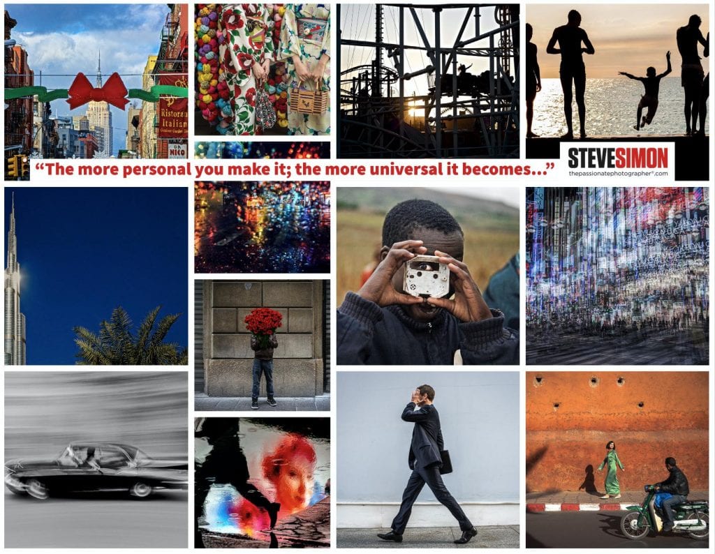
Design in your compositions is not just for aesthetic purposes. Good design means arranging the elements within the frame to get your message across most effectively.
But what makes a photo work is subjective and complicated. A picture doesn’t start working until it is being perceived by the viewer. This is why an image is often hard to describe in whatever quantity of words, be it a thousand or more. Within strong images is a mixture of feeling, information, color, and light, which creates an atmosphere that communicates or evokes an emotional response. It’s complicated.
That said, we use design to organize the visual elements to communicate what we want to say about that subject in the most effective way.
There are certain design principles and established compositional guides that artists have long used to help create stronger visuals. A knowledge of these principles will help you evolve in your work deciding whether to use them or not will become second nature to you as you unconsciously work your pictures.
As Edward Weston said, “Consulting the rules of composition before taking a photograph is like consulting the laws of gravity before going for a walk.”
There is symmetry and there is balance, and the two are not necessarily the same in photography.
It depends more on the visual weight of the elements that make up a photograph. And although it’s difficult to articulate visual weight, think of it as a magnetic pull of your viewer’s eye to certain parts of the image.
Large, light areas can be balanced by small dark ones that have a lot of visual weight thus more “pull,” and vice versa.
Different colors have different visual weight. Light colors generally pull your eye more, as do images with a small splash of color that gets your attention; there is much visual weight in that minority color.
Your eye is also attracted to the sharpest areas within the frame. Elements within the frame with more weight demand more attention from the viewer, and you can increase the pull of those elements by placing them strategically inside the composition.
These concepts can be confusing but know that as you continue your volume of work, many of these concepts will be infused into your unconscious process. Trust that.


